Design: Paradox of Choice
 Here's a simpler explanation of the usability design principle of avoiding choice.
Joel from Joel On Software just wrote a great and simple explanation of the Paradox of Choice.
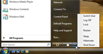
It all centers on what is wrong with this picture. Why are there that many options to choose from when you want to shut down?
Every choice presented to you is something you have to evaluate. That evaluation takes time and brain power. Whenever possible, we should make the choices very very easy and few for the user. Things should "just work".
It is true - the iPod, a battery powered device, doesn't have an off switch. Why are there so many ways to shut down my computer? These choices require 3 separate clicks - Start -> Little Arrow -> Actual Choice.
Joel argues for reducing everything to a "B'Bye" button. One click and it prepares the computer for you being away. And it's just that simple. The task is "I'm trying to leave my computer." Therefore the design should not force the user to interact more with their computer!
I'd only complicate this by putting in a place in the control panel where you can configure this behavior if you care enough to do it.
As I write more on user experience, I'll put these posts under the label "User Experience". If that's all you are interested in, you can go here for just user experience posts.
