Wednesday, November 29, 2006

Prosper.com/Tools is here!

Prosper has revealed their lending API/Tools section . Right now it is just a dump of data from their db, but the api section promises webservices coming soon.

What's cool about this? Now you should see smart folks like me building tools to analyze and pick through prosper loans, flagging good stuff and dissing bad loans. By opening up the data like this, prosper is letting interested people create tools for themselves and others to get better results for their systems.

This kind of openness will be good for their business as reliability goes up and people can make better informed decisions.
Tuesday, November 28, 2006

USPS.com uses Google

Looks like the USPS website uses the google search appliance. I was messing about with the search url and turned this up:

Go to the search form and enter a search for a package.
At the page this takes you too, go to your address bar and erase everything after ?q=######## where ####### is your package search number.

You'll see the secret easter egg usps google home page.

Tuesday, November 21, 2006

Design: Paradox of Choice

Here's a simpler explanation of the usability design principle of avoiding choice.
Joel from Joel On Software just wrote a great and simple explanation of the Paradox of Choice.
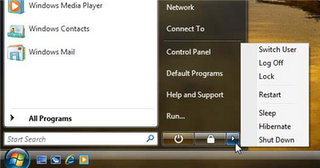
It all centers on what is wrong with this picture. Why are there that many options to choose from when you want to shut down?

Every choice presented to you is something you have to evaluate. That evaluation takes time and brain power. Whenever possible, we should make the choices very very easy and few for the user. Things should "just work".

It is true - the iPod, a battery powered device, doesn't have an off switch. Why are there so many ways to shut down my computer? These choices require 3 separate clicks - Start -> Little Arrow -> Actual Choice.

Joel argues for reducing everything to a "B'Bye" button. One click and it prepares the computer for you being away. And it's just that simple. The task is "I'm trying to leave my computer." Therefore the design should not force the user to interact more with their computer!

I'd only complicate this by putting in a place in the control panel where you can configure this behavior if you care enough to do it.

As I write more on user experience, I'll put these posts under the label "User Experience". If that's all you are interested in, you can go here for just user experience posts.

Monday, November 20, 2006

Design: Wallet

I got a new wallet. It's made out of Tyvek, the stuff that FedEx pouches are made out of. It's waterproof and unrippable. It's also paper thin and light and I love it.
It looks like an Airmail envelope.


Full, it is smaller than my old leather wallet is.


Fits all the stuff I need, plus, I've added a tiny tiny little wallet pen so that I'm never without a pen. It's already come in handy once.

That tiny silver thing in the middle is a wallet pen.
I love this wallet. It is beautiful and lovely and inspires me with how well designed it is.

Snow Trip: Crested Butte Colorado

Brian and I are looking for good folks to join us for a new years-ish trip to Crested Butte. Dates aren't firm yet. If you are interested - get in touch.

Thursday, November 16, 2006

Concert: Marisa Monte

Tuesday night I went out with Nate and Claudia to go see Marisa Monte, a Brazilian singer-songwriter. I understood none of the songs, but it was very good music - chilled out stuff with lazy beats and happy melodies.

The staging was sparse but very effective. A few lightboxes, a platform, a few lights on movable booms and a spot. That was it, but it allowed for so many different moods.

Sometimes it suggested a warm homey room, sometimes a night out at 3 am when it's just you and the moon, sometimes a city night under streetlights... I wish I had pictures that turned out well.

I was also pleasantly suprised that when I googled Marisa Monte, the first result was a link for more info on Google Music - what's all this? Those guys keep indexing all of the world's information in new ways!

User Experience Principles: Avoid Choice but Allow It

Just had a long user experience discussion with coworker Marc about concurrency problems in settings.
His argument:
Everything on a screen should be atomic.
My argument:
Concurrency should be resolved as often as possible without forcing the user to make a choice.
Alice opens up our settings application.
Bob opens up our settings application.
Alice changes the background color on the "Quantity" column in column view "Alpha" and then save it up to our server.
Bob reorders all of the columns in the Alpha column view to the order he thinks is appropriate for their group.
Bob saves the column view up to our server.

Marc argues that Bob's settings should be rejected and he should reload in Alice's settings, then redo his work and save up to our server.

I argue that Bob's settings don't conflict with Alice's because column order is a property of a column view, not of the columns themselves in the column view. Caption is a property of the individual column.
Consider that column order has no meaning for an individual column outside of a column view collection - this is true no matter how you represent these entities in a database.
Bob doesn't care about Alice's caption change, and we should avoid bothering him about it.
If he's changed the caption of the column as well, then we have a conflict. Bob should get notified that Alice made a conflicting change, we should tell him why it conflicts, and then he should get a choice to either abandon his change and accept hers or overwrite her change with his.

Bob wants to change the order of the columns in this column view. Alice wants to change the caption of a column in that column view.
Because what they want does not conflict, we should not get in the way of what they are trying to do. We should just get it done, and let Bob know that Alice has updated some settings.

Wednesday, November 15, 2006

Great news for you - more work for me

I've made the switch to blogger beta, mainly because I love tags.
The tags are up there on the upper left corner, and I'll be going through the old posts and making sure things are tagged appropriately.

Why is this good for you, my loyal handful of readers?
As Jen W put it, I have an awful lot of "weird whacked out computer programmer drama that flies over her head". She's a pal of mine who doesn't care one whit about that stuff.
I've got good news for you, Jen. Now you can only see stuff related to me and my pals.
Change your bookmark to point to just my posts tagged "pals".

And there are some programmer types who frankly couldn't care less about what a nice time I had snowboarding. They want to only see my developer stuff.

There you go. Get the stuff you like from me without the stuff you hate.

I'll be toying around with the template a little bit over the next week or so to make it my own again after switching to this new format.

Tuesday, November 14, 2006

UI Design

I've been assigned to do the User Interface design mock-ups for our settings by my boss because I'm the guy who gets all excited by well designed things and starts talking about user experiences and such. I'm the guy who reads Passionate Users, Infosthetics, Alex Barnett, Etc. I get hot for sparklines.

Most applications are capable of great things, but never get a workout from their users because they are difficult or scary to configure. It isn't obvious to users how to do the things they want to do, so they just learn the minimum and stay with that.

Well designed things are easy joys to use. The best known thing like that right now is the iPod. People who don't know technology are not afraid of the iPod because it works the way they expect it to. In the area that I work in, users are so involved in their business that they can't afford to waste time learning the complexities of their applications. Things that are hard to understand just don't get explored, the users call up the help desk and get someone to do it for them.

Every call like that is wasted money for users and for the development/support teams. The user isn't doing their job and the developers aren't doing their job.

My task is to make sure that our newest application will be iPod easy to use and configure, no small feat when you are doing a hell of a lot more than playing music.

In the beginning I was writing a little sample application that would be a sort of be a dummy with dummy data. Of course, I spent too much time digging into the programming and produced a close-to-working-shell with databinding to object collections. Too much for a mockup. To keep myself thinking about just the design I'm doing the rest as drawings to be implemented. We've got visio somewhere but it's overkill for what I need. I got through just fine using the free web application Gliffy. It's handy and fast, exports to JPG so I can stick it in our freshly minted wiki.

I'm writing up a user experience design guide for my team as well, most of which I'm getting from what I've read in Jensen Harris's UI writings and Creating Passionate Users.

Friday, November 03, 2006

The problem of spam

Been reading a lot about spam problems lately.

It isn't a problem for me, since I'm not a high value target for spam. The other reason is that I've raised the bar by a very tiny amount. CAPTCHAs (those type the letters in the picture tests) are designed to raise the bar for spammers, and I've got kind of a unique one on this blog.

My comments aren't hosted on blogspot, but rather on a site called haloscan. That tiny little difference has meant that I have never displayed a single comment spam ever. Automated comment spam occasionally is done, but it is always done using the normal blogspot comment fields. I get notices of these when they happen, but they aren't a worry because they aren't displayed ever or crawled by search engines.

This works because spam is a problem of economics. It takes very little work to be not worth the effort.
This is also a reason that firefox tends to be more secure than ie6. Fewer folks use it and therefore its less lucrative to write firefox exploits. So one of the surprising things that would tend to make ie6 and the web more secure is if opera, safari, and firefox took off!